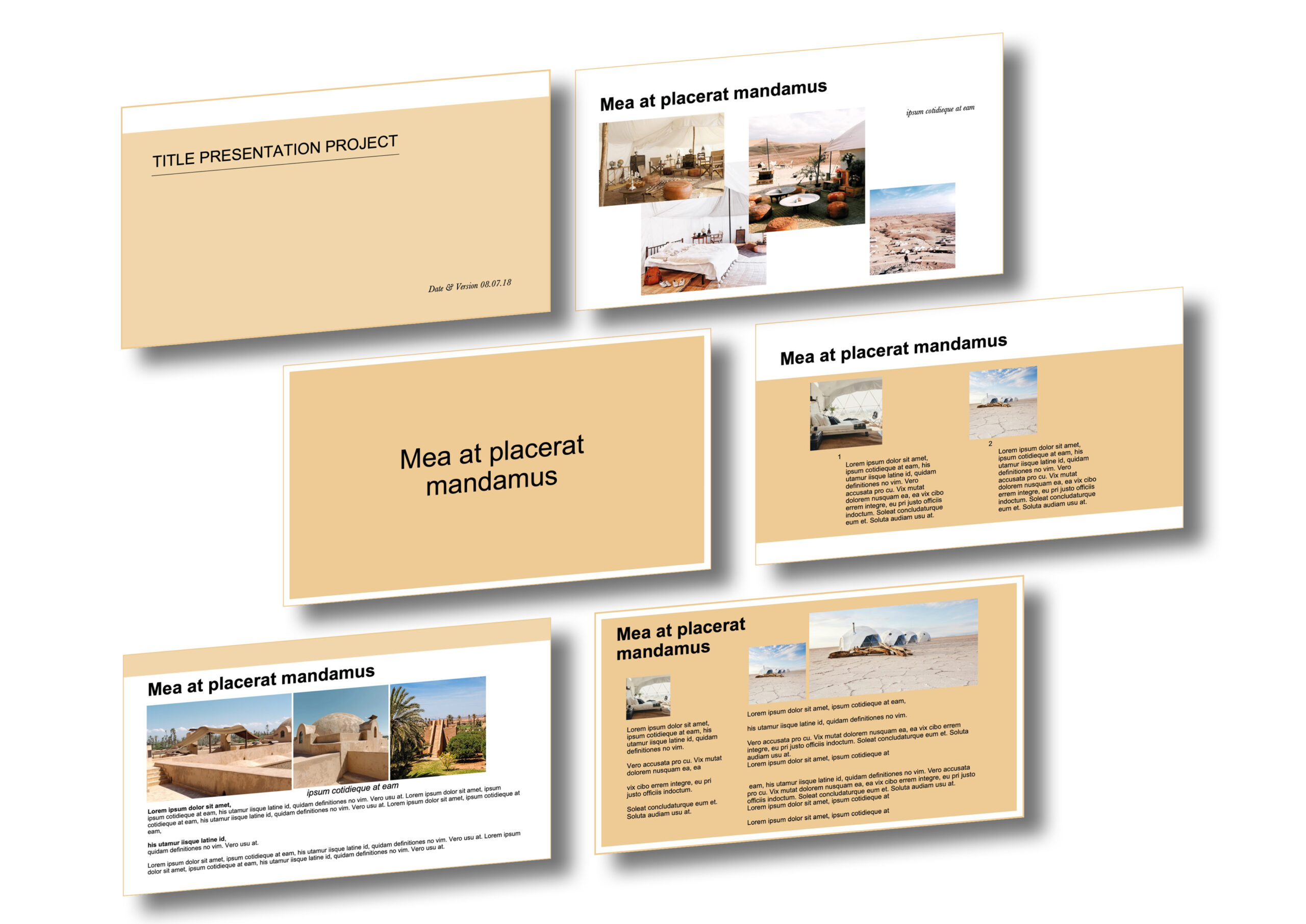
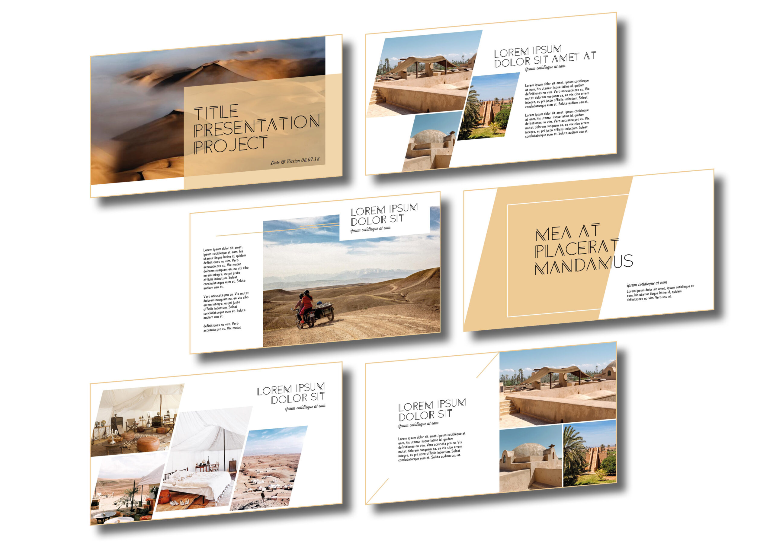
How to design 
an
attractive Powerpoint ?

Did you know the average attention span for a typical audience lasts about 7 minutes ?

You might get 10 minutes if you’re lucky and your subject captivates them. Or 5 if you end up presenting after the lunch break. Be sure that, as soon as the lights go down and the screen comes to life, you won’t have much time to keep your audience alive. 

This is where a good design layout can give you some precious extra minutes of attention to get your message across the room. 

SO, HOW TO DESIGN A PRESENTATION THAT KEEPS YOUR AUDIENCE ENGAGED AND INTERESTED ?

A man presents his project to the work team


LESS IS MORE

  • SHORTEN YOUR TEXTS : I know how tempting it is to write everything you want to say on your slides so you don’t forget… But this is the last thing you want to do. Titles and bullet points are your best friends !
  • REDUCE THE NUMBER OF SLIDES : It’s better to focus on one very good visual slide than 3 overwhelming ones !
  • LEAVE SOME EMPTY SPACE : Very often, people want to put as many contents as they can on one slide. This is a mistake. Keep some spaces free from any contents. Use margins all around your slides and create spaces between images and blocks.


CREATE SECTIONS

  • CATEGORIZE YOUR CONTENTS : Organize your presentation and keep it clear to your audience.
  • CREATE VISUAL SECTIONS : Titles needs to be bigger than subtitles and texts. Use different text colors, change the block background color, highlight part of your text, use bold font to create a logic order into reading your slides…
  • USE VISUALS : a picture is worth a thousands words ! Spend some time finding the right and perfect picture to illustrate your point. This will keep your audience interested.


HAVE FUN

  • BE SURPRISING & USE HUMOR : find funny images to illustrate your point. Use funny examples. Humor can go a long way and often wakes up your audience when you slowly lose their attention.
  • DIVERSIFY YOUR SLIDES DESIGN. Templates are great but if you overuse the same layout for 20 slides, be sure your audience will get bored. Appart from your chapter slides (which should all be similar) HAVE FUN ! Change the position of your texts and pictures from a slide to another.Use backgrounds, charts, pictures, texts, titles, sounds, videos, …


LAST BUT NOT LEAST

  • USE A POWERPOINT TEMPLATE : there are thousands of them online that you can find for free or for a little bit of money. There are a good start! They will give you the frame you need to avoid common mistakes. Get inspired and start creating.
  • GET YOURSELF A DESIGNER : A knowledgable & experienced designer will save you some precious time before your presentation. And every single minute not spent fighting with your design, is a minute you can spend to polish your speech!
Comparison2Comparison3

If you need help with your design, don’t wait, get in touch today and let’s create that dreamy powerpoint you need !

You may also like ...

How to design an attractive Powerpoint ?

How to design an attractive Powerpoint ?

Did you know the average attention span for a typical audience lasts about 7 minutes before you risk to lose them ? This is where a good design layout can…

hellococo@mailo.com